Challenge 13 of 52: Chatime Menu


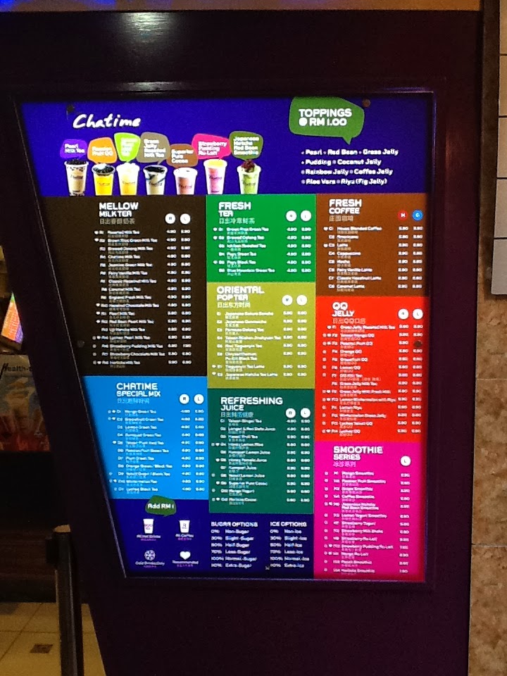
Sometimes, UX problem crops up due to the pace of innovation. This grotesque menu is the victim of Chatime’s success in creating so many variation of beverages. The dense menu is frankly intimidating to new customers and made old customers stick to whatever drink they tasted before. That’s a waste since it will discourage new customers and make it difficult to increase revenue per customer.
Personally, I hesitated several time before buying anything from Chatime until I’m guided by a friend who patronized Chatime in Australia before. Even that he sticks from whatever he bought before and I only picked among the featured drinks. I consider myself fairly adventurous when it come to food and drinks so Chatime barrier seems disporpotionately high.
There’s some visual hierarchy in this menu. The top bar features flagship drinks and this is a saving feature. Customers usually just order from the featured line. But then, more adventurous customers and those who don’t like any of the feature drinks will have a hard time navigating the ala-carte menu.
A clear visual hierachy is missing here, choice of drinks and their personalization options sits on the same level and only separated by different color blocks. This is a stark contrast to Subway’s logical layout that guides customers step-by-step; from bread, filling, cheese, condiments, sauces and sides.
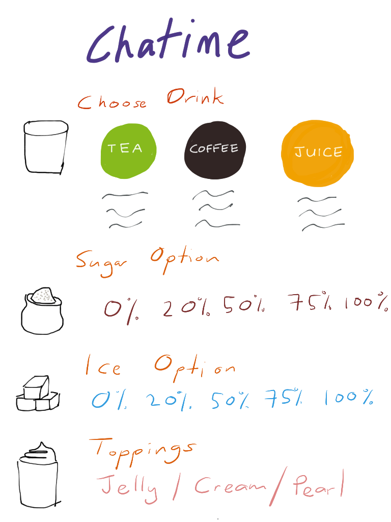
Thus, a better menu design should guide the customers step-by-step. From the base drink, to sugar and ice options. Finally, the upsell to toppings. This should make it easier for new and old customers alike.